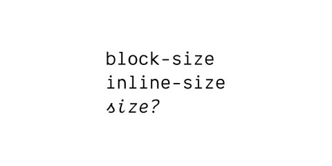
How do we move logical shorthands forward?
There are several proposals, but one major road block
We’re trying to make progress on shorthand syntax for CSS logical properties. But the path forward depends on where we hope to be a decade from now.

Go download & play with it!
We haven’t written full docs yet, and this blog post will be vastly incomplete, but I’ll give you a quick rundown of where we’re going. This is all open to change, of course. There’s a reason we’re still in alpha.
The main difference you will notice from Susy 1.0 is a “natural-language” syntax that allows you to adjust settings more quickly and easily on the fly. You can also go gridless, and we’ll still help you manage your layouts.
The main layout mixin is called span and allows you to span columns on
a grid, or span any width you want, and forget about grids entirely.
// span 50%
@include span(50%);

// span 300px;
@include span(300px);

// span 3 columns
@include span(3);

// span 4 of 12 columns
@include span(4 of 12);

// span the last 3 columns in a 5-column row
@include span(last 3 of 5);

// isolate an item in the last 3 columns of a 5-column row
@include span(last 3 of 5 isolate);

// isolate 2-col width, in the 3rd of 12 columns
@include span(2 at 3 of 12);

// anything can be arbitrary: width (30em), gutter (20px), & location (30%)!
@include span(isolate 30em gutter 20px at 30%);
You can also use various keywords to change your output from the
defaults. Output static or fluid units; move gutters before,
after, split, or inside; isolate or float elements; and so on.
In Susy 2.0, you still can set individual settings, but you can also contain an entire grid in a single argument. That allows us to change grids easily:
$container: 80%;
$columns: 12;
$gutters: 1/4;
$gutter-placement: before;

// or...
@include set-grid(80% 12 1/4 before);
Let’s dissect that.
$container-width setting – in this case 80%.12) or a list of relative column
sizes: (1 2 3.5 2) would create 4 columns of unequal size.1/4 of a column for
us. If you want to establish column/gutter widths as you did in Susy
1.0, you can pass your ratio as a list of two values – (4em 1em) –
and we’ll use those values as column and gutter widths.before, after, split, and inside to change how we handle
gutters; static or fluid to use either fixed or relative widths;
and float or isolate to establish your default positioning.Here are a few grids:
$susy-1-default: 12 (4em 1em) after;
$960-ish: 12 (60px 20px) inside static;
$asymmetrical: (2 8 2) 1/3 isolate;

// set a grid globally
@include set-grid($susy-1-default);

// use a grid locally
@include use-grid($960-ish) {
  /* This code will use the $960-ish grid... */
}
You can use set-grid() to establish new grids anywhere you need, or
use-grid() { ... } to use a new grid for one block of code.
As you can see, we’re trying to make the system as flexible as possible, so you can create the layouts that work for you.
Containers are simple with the container mixin, and the grid syntax
you already learned.
@include container($grid);Of course, we’ll default to any grid you already set globally. you can
also pass an arbitrary width, or add keywords to justify your container
left, right, or center.
// 960 container, justified left
@include container(960px left);
While you’re at it, you can show or hide the grid background for
that particular container:
@include container(show);You can now create a simple gallery layout using either isolation or basic float techniques. The syntax should be familiar already:
@include gallery(2 of 12 isolate);Media-query handling hasn’t been built in yet. We recommend that you use the brilliant breakpoint plugin by Mason Wendell. We’ll add a bit of integration in before 2.0 stable, but for now you can just add the use-grid() mixin inside any media-queries to change your grids:
// using breakpoint
@include breakpoint(50em) {
  @include use-grid($my-grid) {
    /* Your Code Here */
  }
}
There are several proposals, but one major road block
We’re trying to make progress on shorthand syntax for CSS logical properties. But the path forward depends on where we hope to be a decade from now.

Can we get this process unstuck?
The CSS Working Group recently resolved to add a size shorthand for setting both the width and height of an element. Many people asked about using it to set the ‘logical’ inline-size and block-size properties instead. But ‘logical shorthands’ have been stalled in the working group for years. Can we…

It’s not just a shorthand for anchor()
position-area might be my favorite part of the CSS Anchor Positioning spec, with a ton of features packed in to make things just… work. But there’s no magic here, just a few key parts that work well.